Why This Benjamin Moore Colour is My Favourite
Choose the right paint colour
the first time Let me show you how in just 5 easy steps!
BONUS: The Top 15 Shades of Gray by Benjamin Moore

You know the saying “You wear 20% of your wardrobe 80% of the time?” The reason why many of us do this is that we understand what works for our body types, with our skin tones and our preferred style sense.
Believe it or not, the same can be true for choosing paint colours. This is part of the reason why I specify Benjamin Moore’s Pashmina so often.
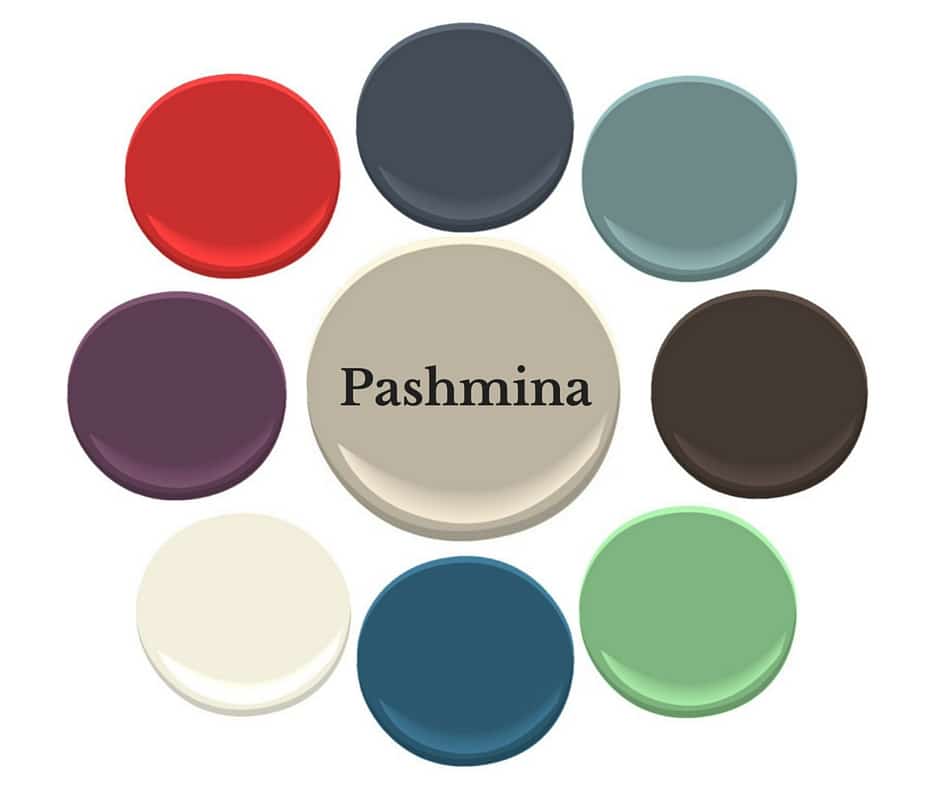
Pashmina by Benjamin Moore
Pashmina, AF100 is from the Affinity Line by Benjamin Moore.
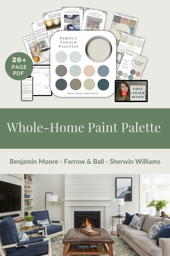
I have created a Perfect Colour Palette for Pashmina. In it, you will find info on undertone(s), comparable colours, best whites and 10 gorgeous colours that look amazing with it.
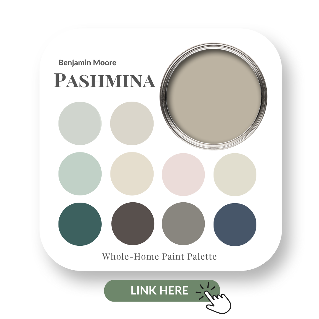
It’s a muddy colour with a green undertone and has slightly more intensity & depth than the popular Revere Pewter.
It’s one of those rare colours that often works well with both the beiges and the grays.
If you’re looking to update your home’s decor without necessarily changing out fixed elements such as floor tiles & countertops, Pashmina may be the answer for you.
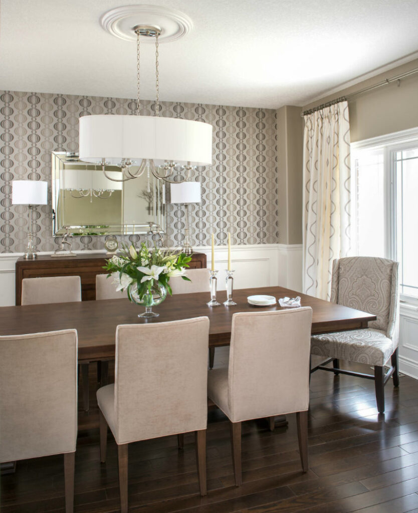
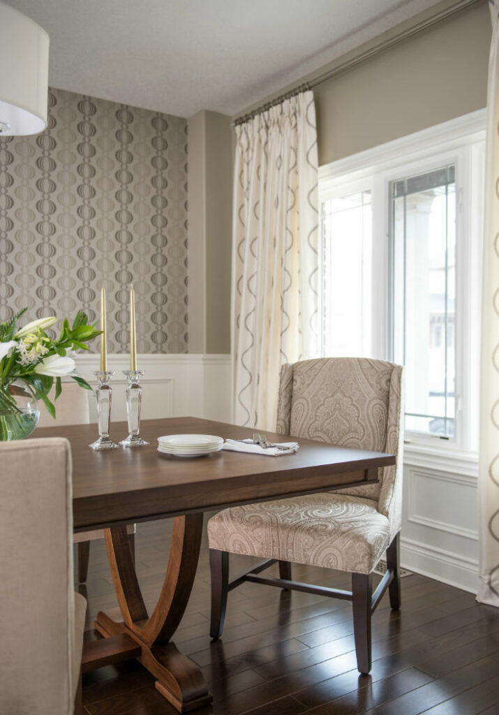
In my client’s elegant dining room design, our ‘jumping off point’ was this wallpaper (above) that I sourced for the accent wall behind the beautifully handcrafted custom wood buffet.
I created a soft monochromatic, neutral palette for an understated yet very refined & elegant look in this space which also happens to be the first room you see as you enter the home.
This meant that I wanted to set the tone of what guests can expect, design and style-wise, for the rest of the home’s décor.
Pashmina provided a rich yet subtle tone that complemented all other aspects of the design.
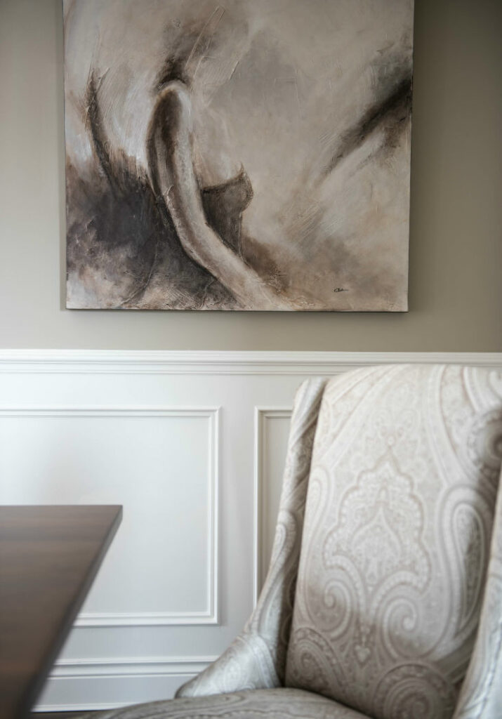
The Host and Hostess Chairs were custom made in this stunning large scale fabric from Duralee. The artwork is an abstract canvas of a lady in a bodice and it again repeats all the neutral ‘greige’ tones that we used in the space.
Pinch pleated custom drapery with a cream backdrop works wonderfully with the Pashmina and we repeated this lighter tone in the lampshades as well as in the beautiful oval-shaped, drum chandelier which takes centre stage in this elegant dining room.
Versatility at its Best!
The other thing that I absolutely love about Pashmina is that it rarely discriminates against any other colour.
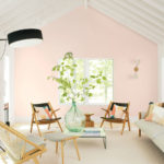
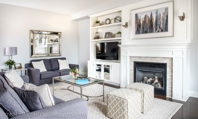
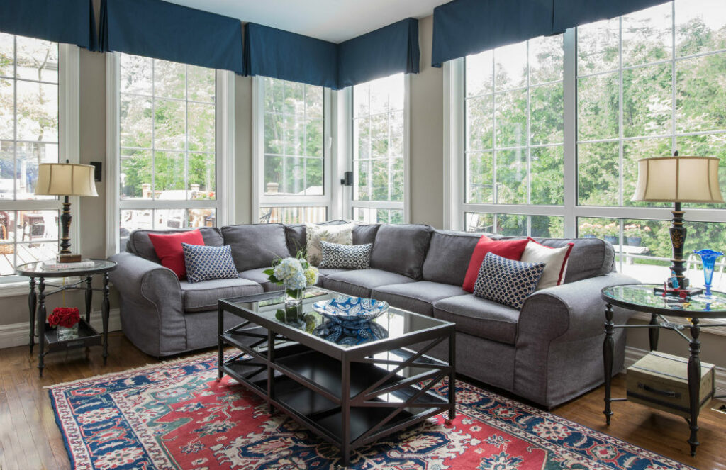
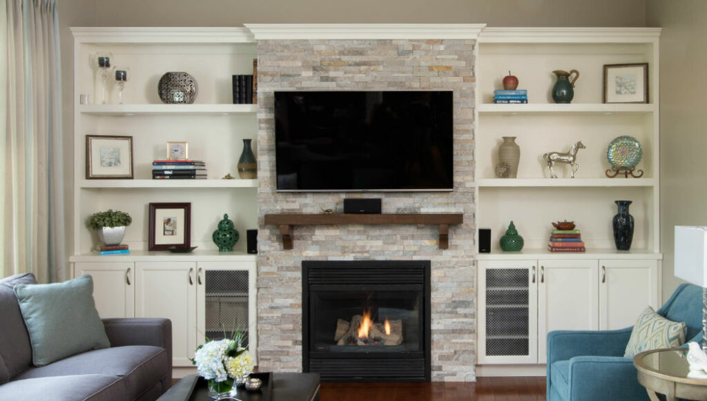
I have used it with blues, reds and greens as you can see from my client’s lakeshore family room design in the photos below.
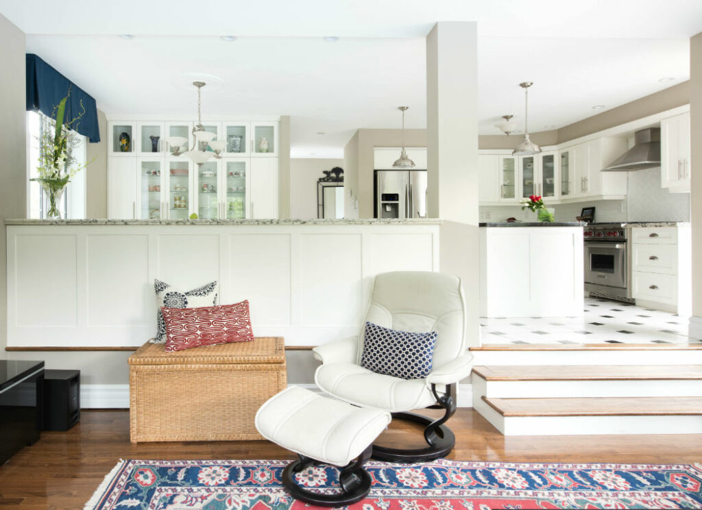
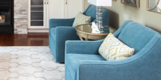
The granite counters in my client’s kitchen (below) had such variations of neutral tones within them.
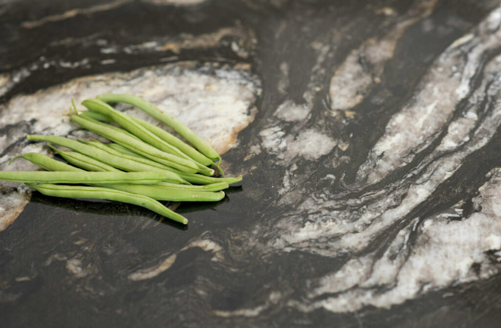
Not only did that allow me to introduce the colour Pashmina to work with this fixed element, but it also worked very well with the bold colours of their original heirloom area rug (shown above) and the accent pillows that I sourced to work with the colour scheme.
My clients are thrilled with the paint colour and tell me that they are always receiving compliments on this space. YAY!
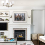
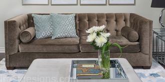
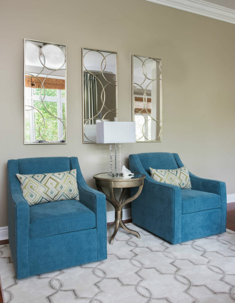
I also used AF100 Pashmina in another clients Family Room design (below).
This chameleon of a colour worked well with the design palette I created with the custom finishes & fabrics as well as with the countertops and backsplash in their adjacent kitchen (not shown).
Always be guided by fixed elements in adjoined rooms to achieve successful flow within your design.
It can be used with so many other colours which is why I just love it so much!
Which colour do you think it looks the best with?
I feel Pashmina will continue to be one of my favourite colours for a long time seeing as the grays are slowly being taken over by these ‘Greige’ tones.
It’s a good thing I have this large painted board in my arsenal!
Have you used Benjamin Moore’s Pashmina for the interior design of your home?
Photos by Stephani Buchman Photography. Thanks for always making my designs look incredible!
Contact me here if you are curious about Interior Design services and live in Burlington, Oakville, Ancaster or surrounding areas of the GTA.
For your convenience
Check out my Pashmina Perfect Colour Palette.
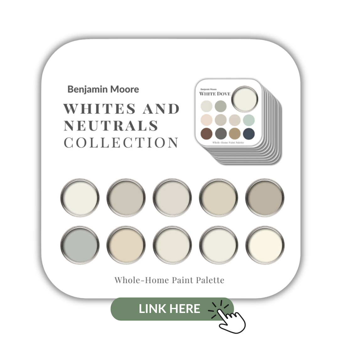
I have also included Pashmina in my Benjamin Moore Whites & Neutrals Collection showcasing all 10 of my Benjamin Moore white and neutral Perfect Colour Palettes.
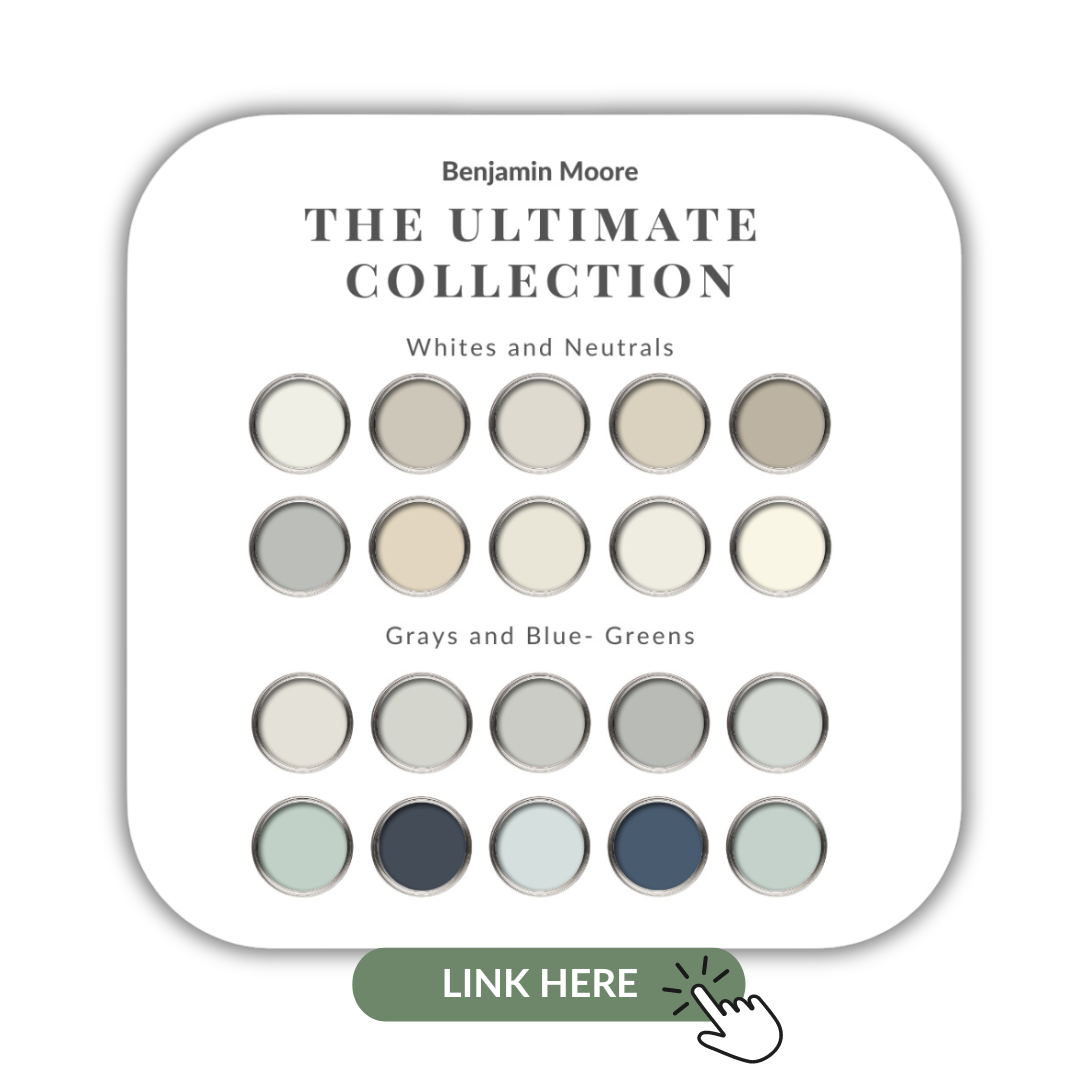
If you want to get all my Benjamin Moore colour guides in one place, look no further than my Benjamin Moore Ultimate Collection. All 20 of my guides in one handy collection.
Remember, it only takes one mistake to take your home decorating project from divine to disaster. Don’t let the paint be what stresses you out!
Perfect For Pinning
Take my Colour Quiz to discover your Perfect Colour Palette.